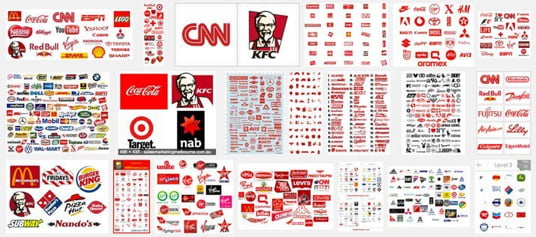
One overlooked tool for marketers is the use of colour. Colour colours how we buy. Colour also plays a role in how we recognize brands. Let’s take a closer look at how colours play with our emotions.
Warm colours, like red, orange, and yellow, are associated with energy and happiness. Orange and yellow can aggravate the eye, however, and is also associated with hunger. McDonalds, anyone? Red is a complex colour because it is also used to evoke feelings of power, of love or lust, excitement, and affluence.
Cool colours, like blue, green, and purple, are calming. They are also sometimes associated with sadness. Blue has a dual personality of relating to sadness as well as tranquillity. Navy and darker blues evoke a sense of professionalism. Green is associated with environmentalism, health, growth, and balance. Purple is associated with royalty, prosperity, and even creativity.
The meaning and symbolism of colours is important to acknowledge when you’re designing a product or even storefront. We like certain colours because of the way they make us feel when we see them. It impacts how we feel about brands. Many have opted for red to evoke a sense of confidence and energy.

Here are some hot tips on how to use colour in a more powerful way.
If you are designing a new brand, try this experiment. Design the same logo in multiple colours and ask different participants how one of the options makes them feel. Do the words line up with your mission and brand offering? Adjust accordingly.
Colours on their own evoke a feeling, but combining colours and lead to and create a more complex emotional reaction. Think about your colour story and the way the pallet works together. For example, blue and yellow suggest the seaside and nature, deep reds, purples, and emeralds suggest royalty. Do these stories align with your message? Whatever it is, don’t think of the colours on their own but in combination.
Use bright colours or accent colours to bring special attention to certain elements of your display or offerings. Big sale? Sell it with colour! Neons are often used for this purpose but a word of caution – if you are a high-end jewellery seller, this might not be the colour to use because it also suggests a sense of economy that might deter shoppers from your high-end product altogether.
Emphasize consistency among your advertisements and messaging. Choosing a number of key colours that represent your brand will give you flexibility but also maintain recognition. If you are using red, orange, and yellow, don’t suddenly throw a forest green into the mix, stay consistent from the beginning. This might help to instil a sense of confidence from your customer-base.
Whatever your business, don’t stay in the dark. Use colour to your advantage.